
Let me ask you something — when was the last time you actually thought about the arrow image on your webpage? Probably never, right? Most of us just grab any arrow PNG from Google, slap it next to a button, and move on. But here is the thing: that tiny decision is quietly affecting how many people actually click.
I have seen blog posts and landing pages transform just by swapping one arrow for a better one. No copywriting changes, no design overhaul — just the right arrow in the right place. In this guide, I will walk you through exactly which types of arrow and pointer PNG images tend to perform better, and the real reasons behind it.
1. Why Do Arrow PNGs Affect Click Rates?
Here is the simple truth: your brain does not read a webpage the way you read a book. It scans, jumps around, and follows visual cues. Arrows are one of the strongest visual cues that exist.
This is called gaze-following behavior — when something points in a direction, your eyes instinctively follow. It is biological, not learned. Designers and marketers have been using this for years because it genuinely works.
Think about it from your own experience. When you land on a page and there is a bold arrow pointing at a button, do you not find your eyes drifting toward that button? That is exactly the effect we are trying to create.
Types of Arrow PNGs — Which Style Gets the Most Clicks?
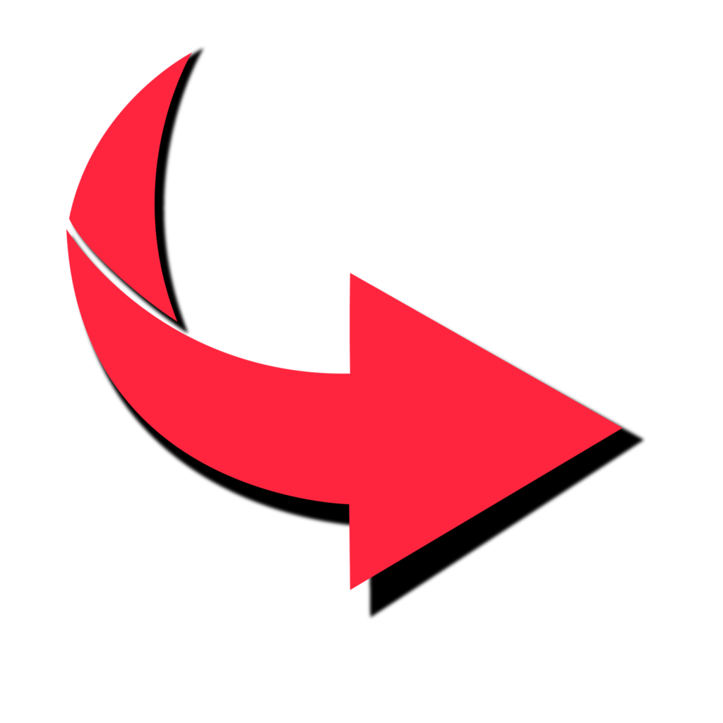
Bold Flat Arrows (Chunky Style)
These arrows feature thick outlines and solid fills. They are highly visible on mobile screens and perform exceptionally well on e-commerce sites and landing pages. Their dominant, confident appearance communicates urgency and direction clearly.
- Best use: Beside Buy Now, Add to Cart, and Shop Now buttons
- Recommended colors: Red (#FF3B30), Orange (#FF6B00), Green (#28A745)


Thin Outline Arrows (Minimalist Style)
Minimalist design is everywhere right now. Thin outline arrows convey a premium, refined feel and work beautifully for SaaS products, portfolios, and high-end brands that want to appear elegant rather than aggressive.
- Best use: Scroll indicators, navigation arrows, feature highlights
- Recommended colors: Dark navy (#1A1A2E), Charcoal (#444444), White on dark backgrounds
Hand-Drawn / Sketch Arrows
These arrows add an organic, human touch to any page. On blog posts, tutorials and personal brand websites, hand-drawn arrows build trust and authenticity — they make content feel personal rather than corporate.
- Best use: Annotations, tip callouts, infographics, blog content
- Recommended colors: Dark ink tones, navy, maroon
3D / Glossy Arrows
These arrows create depth and visual dimension. They work well for gaming sites, tech products and flashy promotions. However, use them sparingly — overuse can make a site look dated or cheap.
- Best use: Hero banners, promotional offers, app download pages
3. Color Psychology — Which Arrow Color Drives the Most Clicks?
The color of your arrow is not just an aesthetic decision — it directly influences user behavior and emotional response. Here is a quick breakdown:
| Color | Psychological Effect | Best For |
| Red / Orange | Urgency, excitement, action | Sales, discounts, CTAs |
| Blue | Trust, calm, reliability | SaaS, finance, healthcare |
| Green | Go, success, permission | Signup, download, proceed |
| Black / Dark | Premium, bold, confidence | Fashion, luxury brands |
| White | Clean, minimal, modern | Dark-theme websites |
4. Direction Matters — Which Way Should Your Arrow Point?
This is the detail most people completely ignore and honestly it makes a real difference. The direction your arrow points sends a subconscious signal to the reader. Here is how to think about each one:
- Right-pointing arrow: This feels like forward movement — the next step, the action, the destination. It is the most natural direction for CTAs like Buy Now, Proceed and Get Started. When in doubt, point right.
- Downward arrow: This is an invitation to scroll. Drop one below your hero headline and visitors naturally feel pulled to explore what is below the fold. Simple but very effective.
- Diagonal upward-right arrow: Feels like growth, ambition, going up. Works nicely in pricing sections or anywhere you want to convey progress and aspiration.
- Left-pointing arrow: This signals going back or reversing. Fine for navigation like Previous or Back, but keep it far away from any action you want people to take.
A practical tip: if you are using a curved or hand-drawn arrow that bends toward a specific element — a testimonial, a form field, a product image — it tends to feel more personal and organic than a straight arrow. Readers connect with it more easily. Try it on a blog post annotation and see how it feels.
5. PNG vs SVG vs Animated GIF — Which Format Should You Choose?
- PNG: Transparent background, crisp quality, universally supported. Good for blog posts and static landing pages. The most widely used format for arrows online.
- SVG: Fully scalable and resolution-independent. Best choice for responsive websites where the arrow needs to look sharp on all screen sizes. Also has a smaller file size than PNG.
- Animated GIF / APNG: Eye-catching and attention-grabbing. Helps reduce bounce rates by drawing the eye. However, excessive animation becomes distracting and hurts user experience.
6. Placement Strategy — Where Should You Put Your Arrow PNG?
You can have the perfect arrow, but if it is placed in the wrong spot it does nothing. Placement is honestly half the battle. Here are the five spots where arrows tend to make the biggest difference:
- After the CTA Button: Something like ‘Download Now ->’ creates a small but clear visual push. The arrow reinforces the action and gives the eye a place to land after reading the button text.
- Hero Section Scroll Arrow: A downward arrow sitting just below your main headline quietly tells visitors there is more worth seeing. Many people scroll past pages without this nudge.
- Pointing to Testimonials or Reviews: An arrow that guides the eye toward a strong testimonial makes that social proof feel more intentional and trustworthy.
- Feature Highlight Arrows: A hand-drawn arrow pointing at a key product benefit feels personal — like someone circled it just for you. It is one of the simplest ways to make a feature stand out.
- Checkout Step Navigation: In a multi-step flow, arrows reduce uncertainty. People feel guided rather than lost, which means fewer people drop off midway.
7. Where to Find Free Arrow PNG Images
If you are tired of jumping between five different websites just to find a decent arrow PNG, let me save you the hassle. WaryHub.com is a free PNG image library with 2,500+ images and growing — and arrow and pointer PNGs are one of its strongest categories.
What makes WaryHub.com worth bookmarking:
- 2,500+ PNG images available — all with transparent backgrounds, ready to drop into any design
- Clean, well-organized library so you are not digging through irrelevant results to find what you need
- Completely free to use — no account required, no credit card required
- Images are optimized for web use, so they load fast and look sharp on all screen sizes
- Regular additions to the library mean you will find fresh options each time you visit
Whether you need a bold red arrow for a CTA button, a minimal outline arrow for a scroll indicator or a hand-drawn sketch arrow for a blog annotation — WaryHub.com is a solid first stop before anywhere else.
8. Test What Works for YOUR Audience
Here is the honest truth: there is no single arrow that works best for every website. What converts on a fitness blog may flop on a SaaS landing page. Your audience is unique, your design context is unique and your arrow choice should reflect that.
The best thing you can do is test. Pick one variable at a time and observe what happens:
- Arrow color — does red or green feel more natural for your CTA?
- Arrow size — does a large bold arrow feel confident or pushy for your brand?
- Arrow direction — right vs diagonal, depending on your page layout
- Static vs animated — does movement help or distract on your specific page?
- Arrow placement — above the button, below it, or beside the text?
Tools like VWO, Hotjar, or even a simple Google Analytics event tracking setup can help you observe user behavior without needing a big budget. Start with the arrow on your most important CTA and go from there. Even small improvements on high-traffic pages add up quickly.
Conclusion
Arrow and pointer PNG images are one of those small details that look insignificant but quietly do a lot of heavy lifting. They guide the eye, reduce hesitation and make your page feel easier to navigate — all without the reader consciously noticing.
You do not need to overhaul your entire design. Just start with one change: pick an arrow style that fits your brand, place it near your most important CTA and watch how users respond. Here is what to keep in mind as you do:
- Bold, chunky arrows command attention and work well for CTAs
- Red and orange feel urgent; blue feels trustworthy; green feels like a green light
- Point right for action, point down for scroll — keep it intuitive
- PNG is your best all-around format for simplicity and compatibility
- Placement next to the action matters just as much as the arrow design itself
- Test one thing at a time and let your own audience tell you what works
The best arrow for your page is the one your specific readers respond to. So pick one, put it somewhere meaningful and see what happens. You might be surprised by something so small making such a visible difference.